
Quick Actions
The quick actions palette is the Panel's command bar: the modal that opens on Mod+Space (or from the button above the sidebar) and lets a user type "restart", hit Enter, and be done. It aggregates everything the user can do from where they currently stand - power actions, navigation, page-specific operations, a server search - into one searchable list, and your extension can put its own entries in there.
There are three surfaces, and which one you want depends on how long your action should live:
| Surface | Registered where | Lives for |
|---|---|---|
| Global actions | enterQuickActions in initialize() | The whole session |
| Page actions | The useQuickActions hook in a component | As long as that component is mounted |
| Modes | The useQuickActionModes hook, or enterQuickActions for static ones | Activated by a prefix the user types |
TIP
Nothing is injected into an action - perform and isVisible take no arguments and close over whatever they need. A global action registered in initialize() therefore has no React state available to it, so anything that depends on the current page, server or user belongs in a component and the useQuickActions hook.
INFO
Quick actions arrived in Panel 1.2.0. On 1.1.x there is no palette and no quickActions registry, so an extension using this API won't build against an older Panel.
Registering a Global Action
Global actions go in your initialize() method, through enterQuickActions:
import { faBroom } from '@fortawesome/free-solid-svg-icons';
import { FontAwesomeIcon } from '@fortawesome/react-fontawesome';
import { Extension, ExtensionContext } from 'shared';
import { getExtTranslations } from './translations.ts';

class MyExtension extends Extension {
  public initialize(ctx: ExtensionContext): void {
    ctx.extensionRegistry.enterQuickActions((quickActions) =>
      quickActions.addAction({
        id: 'dev.0x7d8.cleanup.purgeLogs',
        category: 'power',
        label: () => getExtTranslations().t('quickAction.purgeLogs', {}),
        keywords: ['clean', 'logs', 'purge'],
        icon: <FontAwesomeIcon icon={faBroom} />,
        scopes: ['server'],
        permission: 'files.delete',
        perform: () => purgeLogs(),
      }),
    );
  }
}addAction, addMode and addCategory all return the registry, so you can chain them.
Definition Fields
| Field | Type | What it does |
|---|---|---|
id | string | Identity of the action. Used as the palette's list key, so it must be unique - prefix it with your package identifier. |
category | string | The id of the category this action groups under. A core id (see below) or one you registered. |
label | string | (() => string) | What the user reads. Pass a function for translated labels so it re-resolves when the language changes. |
description? | string | (() => string) | Secondary text, rendered dimmed and right-aligned on the row. Good for a value, a shortcut hint, or a target path. |
content? | ReactNode | Rendered under the label, for what a string can't express - an avatar, a badge, a status dot. Core's server and user modes put an avatar and name here. |
path? | string | The URL the action navigates to, for actions that are really links. Only the / mode reads it, showing it as the row's description and matching the typed term against it. |
keywords? | string[] | Extra search terms. Matched with the same substring rule as the label, so ['mkdir'] makes "New Directory" findable by typing mkdir. |
icon? | ReactNode | Any node, so <FontAwesomeIcon icon={faBroom} /> for a FontAwesome glyph or an <img> for something custom. |
scopes? | ('dashboard' | 'server' | 'admin')[] | Where the action shows up. Omitted means all three. |
permission? | string | string[] | Server permission node(s) required. An array passes if any of them match. |
adminPermission? | string | true | true passes for an admin account or any role that holds at least one admin permission; a string requires that exact admin permission node, with no wildcard expansion. |
danger? | boolean | Renders the row in red and highlights it red when selected. For destructive things - the core "Kill" and "Logout" actions use it. |
isVisible? | () => boolean | Last-word visibility check, run on every palette render. Use it for state, not permissions. |
perform | () => void | Runs when the user picks the action. |
The scope of an action is derived from the current URL, not from where you registered it: /server/<id>/... is server, /admin/... is admin, everything else is dashboard.
WARNING
permission is checked against the current server's permissions, and outside server scope there are none - so an action with permission set is silently hidden on dashboard and admin pages. If you want a permission-gated action that also appears outside a server, pair permission with scopes: ['server'] and register a separate unpermissioned action for the other scopes.
Reaching Page State
There is no context object. isVisible and perform are plain closures, which means a global action registered in initialize() can only reach module-level things - your own helpers, an API call, getQuickActionsStore(). Everything React-shaped (the current server, the websocket, navigate, the logged-in user) comes from hooks, so an action that needs any of it has to be registered from a mounted component with useQuickActions.
Core works the same way, and where it registers an action tells you its lifetime: the power actions come from a component the server router mounts, so they exist exactly as long as a server is open and never need a scope check, while navigation and logout are built by the palette itself. Prefer that over a globally-registered action with an isVisible that inspects the URL:
import { useNavigate } from 'react-router';
import { useQuickActions } from '@/plugins/quick-actions/useQuickActions.ts';
import { useServerStore } from '@/stores/server.ts';

export default function MyServerWidget() {
  const navigate = useNavigate();
  const server = useServerStore((state) => state.server);
  const serverState = useServerStore((state) => state.state);

  useQuickActions([
    {
      id: 'dev.0x7d8.cleanup.purgeLogs',
      category: 'power',
      label: () => getExtTranslations().t('quickAction.purgeLogs', {}),
      permission: 'files.delete',
      isVisible: () => serverState === 'offline',
      perform: () => purgeLogs(server.uuid),
    },
  ]);

  return /* ... */;
}
The palette closes itself before calling perform, so you never need to close it from an action - only mode items, which own their onSelect outright, have to do that themselves.
isVisible runs during the palette's render, on every keystroke. Keep it to synchronous reads of values your component already has, or a Zustand .getState(), and never call hooks or fire requests from it.
WARNING
Because the definitions array is re-read from the palette's render rather than yours, label, isVisible and perform must not contain hooks. Close over the values instead, the way the example above closes over serverState.
Categories
Every item belongs to a category, which is the labelled group it renders under. The Panel ships eight:
| Id | Group heading | Order | Contains |
|---|---|---|---|
math | Calculator | 10 | The = calculator result |
page | This Page | 20 | Actions the current page registered |
pageNavigation | Page Navigation | 25 | The tabs of the current page's sub-navigation, registered by the Panel. Stacked tab bars use pageNavigation:<depth>, ordered so the innermost leads |
power | Power | 30 | Start / stop / restart / kill |
servers | Servers | 40 | Server search results, from the # mode and the dashboard's no-prefix search |
users | Users | 45 | User search results from the admin-only @ mode |
navigation | Navigation | 50 | Sidebar routes for the current scope |
account | Account | 60 | Logout |
Reuse one of those ids when your action fits the group - a power-adjacent action belongs under Power, not under a category of its own. When it doesn't fit, register your own:
import { faDragon } from '@fortawesome/free-solid-svg-icons';
import { FontAwesomeIcon } from '@fortawesome/react-fontawesome';

ctx.extensionRegistry.enterQuickActions((quickActions) =>
  quickActions.addCategory({
    id: 'dev.0x7d8.cleanup',
    label: () => getExtTranslations().t('quickAction.category', {}),
    icon: <FontAwesomeIcon icon={faDragon} />,
    order: 25,
  }),
);
label takes a plain string or a getter, same as on an action. icon is a ReactNode here too, though it's rendered as a group heading rather than a row.
Groups render by order, lowest first, with ties broken alphabetically on the resolved label. A group whose heading repeats the one directly above it drops the text and keeps only the icon, which is how a page's stacked tab bars read as one section - so two categories sharing a label render as one headed group followed by unnamed ones. Core categories hold the numbers in the table above, and a category without an order falls back to 100, which puts it after core and sorted by label among the other extension categories. The order: 25 in the example above lands the group between Page and Power, so pick a number when you care where your actions sit relative to core's.
Extension categories are merged last, so registering one with a core id such as page or power overrides that group's label, icon and order for the whole palette. That's occasionally useful and more often a mistake.
An action pointing at a category nobody registered still renders: the raw category id becomes the group heading. If you see dev.0x7d8.cleanup as a heading, you forgot the addCategory call.
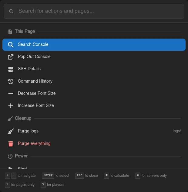
The palette above is what the worked example at the end of this page produces on a server page: the Cleanup category sits between This Page and Power because of its order: 25, the second action is red because of danger, and the % mode's hint has joined the footer.
Page-Scoped Actions
An action that only makes sense on one page shouldn't be registered globally with an isVisible that checks the URL. Use the useQuickActions hook instead, from a component that's mounted on that page:
import { faFileCirclePlus } from '@fortawesome/free-solid-svg-icons';
import { FontAwesomeIcon } from '@fortawesome/react-fontawesome';
import { useQuickActions } from '@/plugins/quick-actions/useQuickActions.ts';
import { CORE_QUICK_ACTION_CATEGORIES } from '@/lib/quickActions/coreQuickActions.tsx';

export default function MyServerPage() {
  const [selected, setSelected] = useState<string[]>([]);

  useQuickActions([
    {
      id: 'dev.0x7d8.cleanup.purgeSelected',
      category: CORE_QUICK_ACTION_CATEGORIES.page,
      label: () => getExtTranslations().t('quickAction.purgeSelected', {}),
      icon: <FontAwesomeIcon icon={faFileCirclePlus} />,
      isVisible: () => selected.length > 0,
      perform: () => purge(selected),
    },
  ]);

  return /* ... */;
}
The hook takes the same QuickActionDefinition[] as addAction, plus an optional second argument to switch registration on and off:
useQuickActions(definitions, !loading);Actions registered this way disappear when the component unmounts, and they go through exactly the same scope, permission and visibility filtering as global ones. The page category exists for them, and it's what the Panel's own file manager uses for its file and selection actions. The hook registers nothing while its component renders inside a virtual window; only the main window feeds the palette.
The array is re-read on every palette render rather than captured at mount, so closures over component state stay current: selected in the example above is always the live value, and you never have to re-register. The tradeoff is that label, isVisible and perform are called from the palette's render rather than yours, so they cannot contain hooks.
TIP
Tabs are handled for you. Every SubNavigation puts its visible tabs into the palette under pageNavigation, so items you add through a page's subNavigation registry (see Mounting UI) are reachable from the palette without registering anything. Where two tab bars stack - a nest and one of its eggs - each bar gets its own group, innermost first, so the two "General" tabs stay apart. Only the first of those groups is named; the rest repeat its icon without the heading.
INFO
Something has to render the component for the hook to fire. A page you registered with addServerRoute works, and so does a component you slotted into a core page - see Mounting UI. If you want actions present on a page you don't own, register them globally with an isVisible check instead.
Modes
Modes turn the palette into something other than a list filter when the query starts with a given prefix. Core ships four:
| Prefix | Mode | Available |
|---|---|---|
= | Evaluates a math expression and offers to copy the result | Everywhere |
# | Searches servers and jumps to one, keeping the page you are on | Everywhere |
@ | Searches users and jumps to one | Admin scope, with users.* |
/ | Path-based navigation search over the sidebar routes and the current page's tabs, showing each URL alongside its name - a tab shows its path relative to its own tab bar, since the page's own URL is mostly uuids | Everywhere |
Two of those show what modes can do beyond a flat list. # changes shape by scope: outside admin it lists the servers you can access and jumps to the client area - from inside a server it keeps the page you are on, the way the sidebar's switcher does, and picking the server you are already on returns to its console - while in admin (with servers.*) it searches every server, renders each owner's avatar and username via content, and jumps to the admin view instead. @ is conditional: it isn't registered at all outside admin, so its footer hint disappears and @ falls through to ordinary label matching. A mode is just an entry in the array you return, so omitting it is all "conditional" means:
useQuickActionModes([
  mathMode,
  serversMode,
  ...(canSearchUsers ? [usersMode] : []),
]);
A mode's items are a plain array, built from the query the user has typed. That query lives in the palette's store, so a mode is written from a component with useQuickActionModes, the same way page actions are written with useQuickActions:
import { faUser } from '@fortawesome/free-solid-svg-icons';
import { FontAwesomeIcon } from '@fortawesome/react-fontawesome';
import { useQuickActionModes, useQuickActionTerm } from '@/plugins/quick-actions/useQuickActions.ts';
import { useQuickActionsStore } from '@/stores/quickActions.ts';

const PREFIX = '%';

export default function PlayerMode() {
  const setOpen = useQuickActionsStore((state) => state.setOpen);
  const term = useQuickActionTerm(PREFIX);
  const players = usePlayerSearch(term);

  useQuickActionModes([
    {
      id: 'dev.0x7d8.players',
      prefix: PREFIX,
      hint: () => getExtTranslations().t('quickAction.playerHint', {}),
      loading: players.loading,
      items: players.items.map((player) => ({
        key: `player:${player.uuid}`,
        category: 'dev.0x7d8.cleanup',
        label: player.name,
        description: player.uuid,
        icon: <FontAwesomeIcon icon={faUser} />,
        onSelect: () => {
          setOpen(false);
          kickPlayer(player.uuid);
        },
      })),
    },
  ]);

  return null;
}
useQuickActionTerm(prefix) gives you the query with your prefix stripped and trimmed, or null while the query doesn't start with it - so null means "my mode isn't active" and '' means "active, nothing typed yet". Gate your fetching on it, the way core's # mode only requests servers while term !== null.
| Field | Type | What it does |
|---|---|---|
id | string | Identity of the mode |
prefix | string | The string that activates it. Usually one punctuation character |
hint | string | (() => string) | Shown next to the prefix in the palette's footer bar, so users can discover the mode |
items? | QuickActionItem[] | The rows your mode contributes |
map? | (item) => QuickActionItem | null | Filters and rewrites the normal rows while your mode is active. null drops one |
loading? | boolean | Shows the palette's spinner while your mode is fetching |
A few behaviours shape how you write one:
- The palette picks the first mode whose prefix the query starts with. Core modes come first, then modes from
useQuickActionModes, then staticaddModeregistrations, so=,#and/are unavailable to you - as is@in admin scope - and a hook-registered mode shadows a static one with the same prefix. Prefixes core does not use include%,~,&,:and!. - While a mode is active the label and keyword matching is bypassed, and whatever
itemsholds is shown as-is. Filtering on the term is your job, which is what makes modes useful for computed and fetched results that no substring match would find. - Actions and navigation entries survive only if your
mapreturns them, so a mode with justitemsgives the user a single-purpose list. Implementmapwhen you want to narrow the existing list instead of replacing it, the way core's/mode keeps only the two navigation categories and hangs each route's path offdescription. - Build
itemsfor the active term only. The array is read on every palette render, so keep it cheap - do the fetching in a hook and map its results, don't compute anything heavy inline.
Items you build yourself use QuickActionItem rather than a definition, which is a slightly different shape: key (unique across the whole list), category, label and description as already-resolved strings rather than getters, plus optional content, path, keywords, icon, danger, and a required onSelect. The palette filters none of these for you, checking neither scope nor permissions, so verify whatever matters before you offer an item. It also doesn't close itself for mode items the way it does for actions, so call setOpen(false) from onSelect when the item should dismiss the palette.
Static Modes
quickActions.addMode(...) from initialize() still works and takes the same shape, but a mode registered there has no way to read the query, so its items can only ever be a fixed list. Reach for it for a small constant menu behind a prefix, and use the hook for anything that reacts to what the user types.
INFO
Something has to render the component for useQuickActionModes to fire, exactly as with page actions - and a mode registered from a page-scoped component only exists while that page is open. For a mode that should work everywhere, mount the component through a global slot; see Mounting UI.
Opening the Palette Yourself
The palette's open state is a Zustand store, so you can drive it from your own UI - a button in a card, a step in an onboarding flow:
import { useQuickActionsStore } from '@/stores/quickActions.ts';

export default function MyCard() {
  const setOpen = useQuickActionsStore((state) => state.setOpen);

  return <Button onClick={() => setOpen(true)}>Search</Button>;
}
The store also holds query, which is what the user has typed - that's the value useQuickActionTerm reads. Outside React, getQuickActionsStore() from the same module gives you a synchronous snapshot with the same setOpen, toggle and setQuery. The built-in Mod+Space shortcut and the sidebar trigger go through that same store. If you want your own key binding for something, the adjacent enterShortcuts registry lets you register a shortcut with a default binding that users can rebind from their account settings.
A Worked Example
Putting the pieces together - an extension that registers its own category, one server-scoped action gated on a permission, and one destructive dashboard action. Both are stateless, so they can live in initialize(); anything that needed the current server's state would move into a component with useQuickActions:
import { faBroom, faTrash } from '@fortawesome/free-solid-svg-icons';
import { FontAwesomeIcon } from '@fortawesome/react-fontawesome';
import { Extension, ExtensionContext } from 'shared';
import { getExtTranslations } from './translations.ts';

const CATEGORY = 'dev.0x7d8.cleanup';

class CleanupExtension extends Extension {
  public initialize(ctx: ExtensionContext): void {
    ctx.extensionRegistry.enterQuickActions((quickActions) =>
      quickActions
        .addCategory({
          id: CATEGORY,
          label: () => getExtTranslations().t('quickAction.category', {}),
          icon: <FontAwesomeIcon icon={faBroom} />,
        })
        .addAction({
          id: 'dev.0x7d8.cleanup.purgeLogs',
          category: CATEGORY,
          label: () => getExtTranslations().t('quickAction.purgeLogs', {}),
          keywords: ['clean', 'logs'],
          icon: <FontAwesomeIcon icon={faBroom} />,
          scopes: ['server'],
          permission: 'files.delete',
          perform: () => purgeLogs(),
        })
        .addAction({
          id: 'dev.0x7d8.cleanup.purgeAll',
          category: CATEGORY,
          label: () => getExtTranslations().t('quickAction.purgeAll', {}),
          icon: <FontAwesomeIcon icon={faTrash} />,
          danger: true,
          scopes: ['dashboard'],
          adminPermission: true,
          perform: () => purgeEverything(),
        }),
    );
  }
}

export default new CleanupExtension();
Guidelines
- Prefix your ids with your package identifier. They're the palette's list keys, and a collision with core or another extension leaves one of the two actions unreachable.
- Pass a getter for
labelrather than a string, since the palette re-resolves labels on render: a getter follows a language switch and a literal doesn't. See Translations. - Add keywords for anything users would search by another name. The match is a plain case-insensitive substring over label and keywords, without fuzzy matching or stemming, so "mkdir" only finds "New Directory" if you put it there.
- Reserve
dangerfor destructive actions, so that a red row keeps meaning "this one you can't undo". - Confirm destructive things.
performfires straight off an Enter keypress, so if the action is irreversible, haveperformopen a modal instead of doing the work. Core's "Kill" and "Log out" actions do exactly that, each registered from a component that owns its own confirmation modal. - Don't register the same thing twice. An action that's also a sidebar route is already in the palette under Navigation, and a tab you added to a page's sub-navigation is already there under Page Navigation.